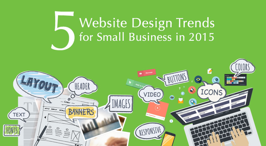
5 Website Design Trends for Small Business in 2015
Monday July 27, 2015
Your website is the face of your business. It’s the first impression many prospects will get of your business, so it’s important that it looks professional, attractive, and reputable.
Design trends often seem like they change too quickly to keep up, but a modern, attractive design sends a positive signal to your visitors. They’ll be able to see you take your business seriously, that you’re professional, and they’ll trust that the information on your website is up-to-date.
You don’t have to follow every trend, but it’s a good idea to evaluate your website whenever there are big changes to the website design industry. So, with the rise of mobile technology and the importance of mobile-responsiveness, it’s a good time to take a look at your site and make sure it meets the new standard, and looks at least acceptably modern.
1. Mobile Responsiveness
Every month, the number of people who use mobile devices to browse the internet increases. Mobile searches are increasing steadily, and Google has recently made mobile-responsiveness part of their ranking criteria.
Mobile-responsiveness for business websites is no longer a luxury. It’s the new standard.
If your website is difficult to see and use on mobile devices, it’s time to stop ignoring the problem. Investing in a responsive design is a huge step to future-proof your website so you have to make fewer updates down the road.
Click here to get my tips to mobile optimize your ecommerce site.
2. Bigger and Bolder
The “minimalist” style is still in full swing halfway through 2015. That means fewer, but higher quality, visual elements. It means a clean, open layout, and it means bold, unique typography and use of color.
Gorgeous Images and Videos
As technology allows bigger, higher-quality images and videos to load faster, they’re becoming more and more common in web design, especially on homepages.
Image sliders are still popular, as are single, large images at the top of the page. More and more sites are using large, high-quality videos (usually without sound) as their homepage header.
Stunning, beautiful visuals lend your site credibility, reinforce branding, and can tell a story about your business or product more effectively than words. But never sacrifice loading speed! If people navigate away from your site before your masterpiece has even loaded, your gorgeous design is worse than useless.
Unique Typography
Typography is becoming more and more prominent, and many sites are even using headers that are just big, bold text, without any images at all.
Your font choice and stylization can say a lot about your brand, so choose carefully, preferably with the help of a designer. No matter how prominent typography is on your website, select a few compatible fonts to use throughout your site. This gives you a cohesive, clean, and professional look.
Bold Blocks of Color
Solid blocks of vibrant color can help tell a story for the eye, guiding your visitors to the content, pages, and calls to action that you want them to focus on.
Whether you use pops of bright color to draw the eye to specific elements, or if you use a lot of bright color to make your website beautiful, branded, and memorable, make sure you choose your colors and their placement carefully.
3. Grid Layouts
Grid layouts have the advantage of being visually pleasing and extremely mobile-friendly. It’s no wonder they’ve been a long-lasting design trend.
A grid layout means the webpage is divided up into rows and columns (regularly spaced or not) that divide the design into sections. It’s a good way to organize different types of content, declutter a homepage, and keep the eye moving on the page.
The classic example is Pinterest, which is a grid layout in a “card” style, which is just a way of describing the particular type of grid. That is, with regular spacing between very distinct elements of varying sizes.
4. Creative Navigation
Traditional navigation bars appear at the top of the screen, offering a clear roadmap of the site. This is the norm for a reason—it’s clear, organized, and it’s what most visitors expect.
A newer take on this is to have the navigation bar stay at the top of the page, no matter how far down you scroll. This allows for longer homepages, without losing that roadmap and sense of structure at the top of the page.
But if your brand could benefit from a little betrayal of expectation, you might want to reconsider the idea of navigation altogether. Many sites are switching to one long, scrolling page, which you navigate with creative sidebars or other types of visual storytelling.
Parallax scrolling sites are particularly popular. This just means that elements in the foreground scroll faster than the background, creating a more immersive, continuous page experience.
5. Flat Elements
Flat design is a close cousin of minimalist design, and the two often pair well together. Flat design refers to design that is two-dimensional, often with line drawings, crisp edges and outlines, and a lack of drop shadows, textures, and other dimensionality cues.
Pure flat design is being blended more and more with strategic use of texture and dimension to draw the eye, highlight contrast, and make websites easier to use.
Flat Icons
Icons are seeing a big upswing in recent years, but they’re flatter, more stylized, and more interactive than in the past.
Many icons are now in a line-drawn, simple style, or even stylized to look hand-drawn. Icons are a very important branding element for your site—don’t ignore them.
More and more, icons are used to back up blurbs of text. This works particularly well for explaining benefits and features of products or services. The presence of the icon cues the reader with a basic understanding of what the text is going to be about, improving their understanding and experience.
Ghost Buttons
Ghost buttons are a huge trend right now. They’re so trendy, in fact, that they need to be used vary sparingly in order to have impact at all.
A ghost button is just a very simple button with no fill at all. Often they are a simple outline of a basic button shape, with text on the inside. They work well over background images (as long as the contrast is high enough) because they don’t distract from the image.
Some more complex ghost buttons light up, move, or fill in with color when you hover your mouse over them. This helps solve one of the biggest problems with ghost buttons, which is that your visitors may not realize they are buttons at all.
One of the most effective ways to use a ghost button is in contrast with a flat, colored button. This draws the eye to the colored button, which should be your primary call to action. The ghost button serves to de-emphasize the secondary call to action, so the viewer has less distraction from your main goal for the page.
What design trends have you noticed lately that you like? Let us know in the comments!

Paige Schartz
Paige is the Programming Lead at AllProWebTools. She enjoys working with her clients and the daily challenges of keeping up with the fast pace of technology. She is constantly reading and learning about all the latest Internet technologies in an effort to provide her clients with the most up-to-date and relevant changes to this landscape.
Find on Google+Categories
Recent Posts
Popular Tags
customer service habits organization holidays driving tasking tool transitions colorado tub repair automation teamArchives
Subscribe
